A beautiful weather visualization app lets you compare how it feels in different places around the world throughout the year.
365
days41,997
weather stations22,104,961
measurements
Live Demo
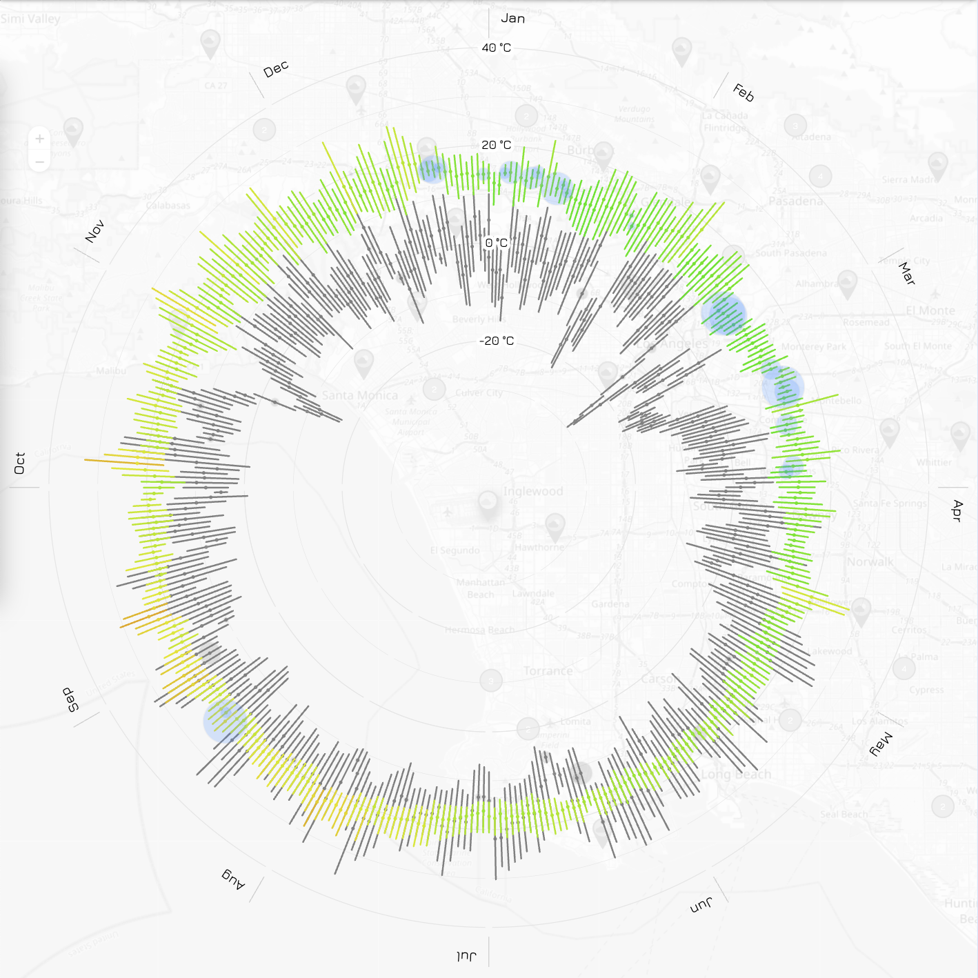
Select a climate station on the map to view the weather snapshot. It features 365 bars along the temperature scale, where the base (closer to the center) represents the lowest daily temperature, and the top shows the highest. The bar’s color indicates the average temperature. Daily precipitation is displayed as blue circles, with the diameter reflecting the amount.
Click “+” to add another city for comparison, just like in the header image.
* Data from NOAA