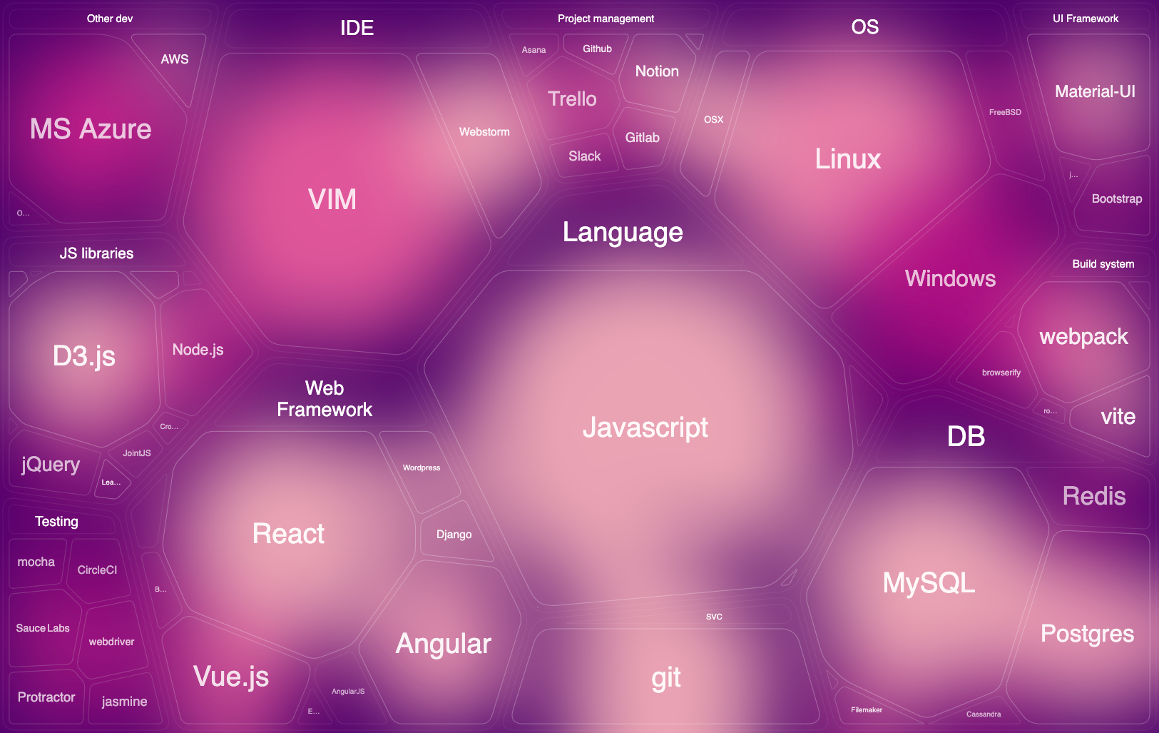
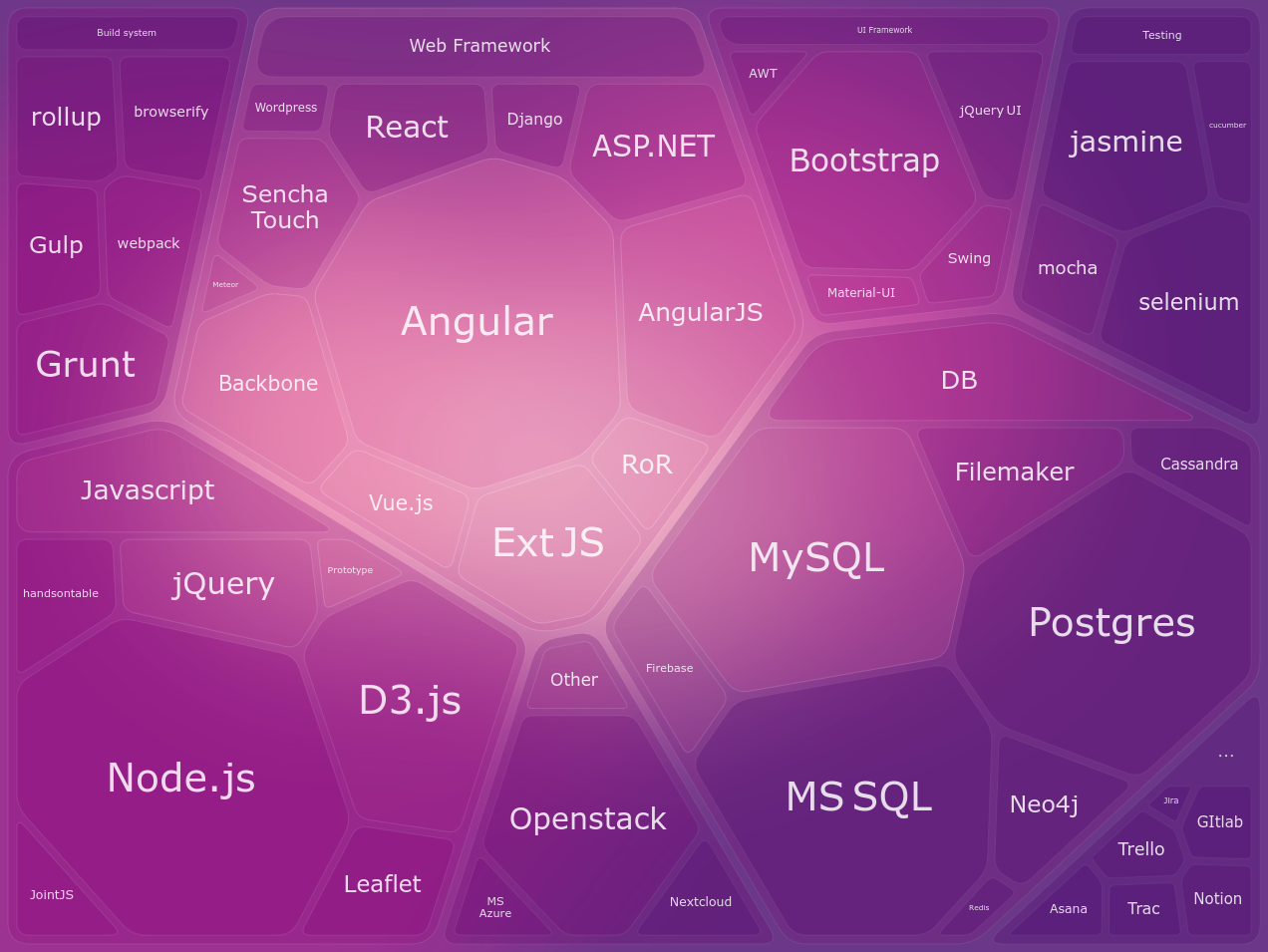
This is a visualization of technologies I have used throughout my career up to the last update.
Cell size is proportional to the actual time spent using it.
Color highlights recency.
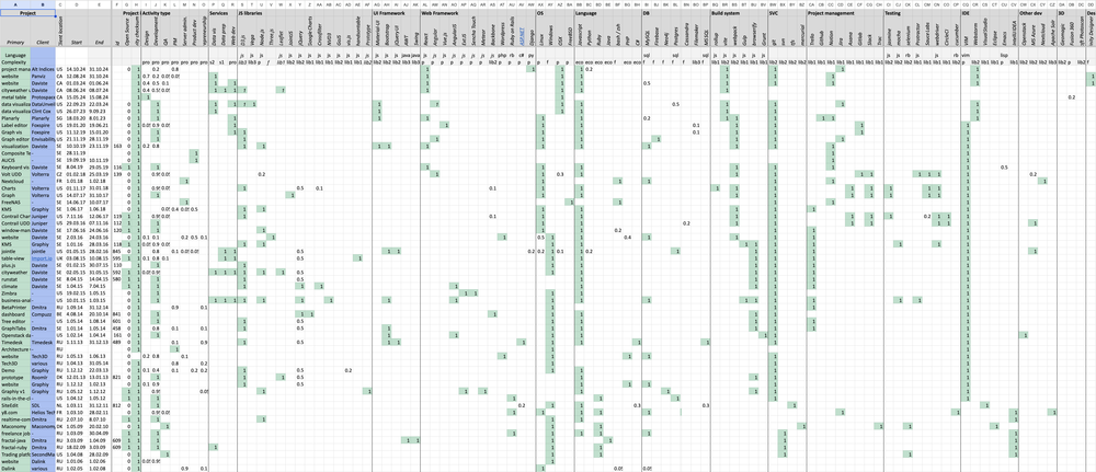
It’s interesting to compare how things changed in 4 years:
I maintain a timeline in a spreadsheet with all completed projects and technologies used breakdown
For associated technologies graph I group items by following categories:
- Major libraries
- Databases
- Web framework
- UI framework
- Build system
- Test framework
- Project management tools
- and other worth mentioning technologies