What looks like a cards boars is a bookmarks storage with a smart search.
Organized by tags you added, url, title and url.
While you may no longer use bookmarks, everyone still would like to have the links of interest within reach.
What is the problem with bookmarks?
There are lots of them!
And they doesn’t have an order. Information keeps growing and there is no more use to place bookmarks in folders because one folder – one association.

But how many associations do you have with the famous quote:
“You forget what you want to remember, and you remember what you want to forget.”
I’m sure I’ve seen it somewhere on internet, or may be my friend told me.
But I have no idea how to find that exact peace of information right here right now!
And that is crucial.

But that leads to even bigger problem:
Dozens of opened tabs in browser.
We are looking for the same thing again and we can’t not only organize our information but even to access it.

Here are some popular services for links saving
Does they differ from the browser bookmarks mess? Evernote, Google Chrome, Xmarks.
Some of them are: like Pocket or Pearltrees.
But most of them don’t.

The list of competitors are almost endless – and that is good sign – the market is big enough.
But the problem remains. Each one new service you try – the more disconnection you have.
The day when Steve Jobs had introduced Ipad he said: “It’s like holding an internet in your hands.”
He was absolutely right

Every 60 seconds millions of items are created by people with mobile devices only

Apple turned cloud information storage into information access.
Timedesk is a bookmarks storage inside and cards board outside. With a smart search.
It searches by tags you added to saved link, title and url. We tried to add some AI to autotag links. But users don’t care essentially about what system suggests about link. Everyone has it’s own mindset in which that link should go and where they would search for it.
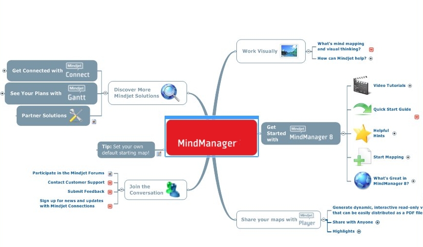
That is why we decided to add some visual shape, like mindmap.

But it can’t be a mindmap, because there is no root and each link has many tags.
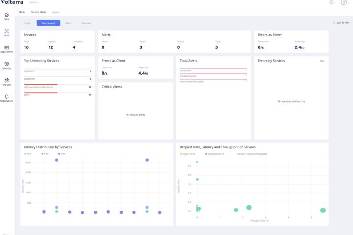
So, it should be a graph interface.
I’ve made a research recently on such interfaces and didn’t find general one.
The closest try is TheBrain.com

So, we decided to make it.
Stay tuned.
If you are using mind managers and would like to make it better – write me.


